
Architecting social infrastructure for modern parenting
Parenthood shouldn't be an isolated journey. I designed Kiddify to replace fragmented group chats and localized 'word-of-mouth' with a secure, high-trust ecosystem for community-driven playdates.
Strategy, research, UX/UI and brand — owned by one designer
Research across local and emigrant families to remove cultural bias
Every screen traced back to a research-backed pain point, not a feature wishlist
Testers offered to pay before any launch — confirming the core idea holds
.webp)

.svg)
.svg)
.svg)
To ensure the data was robust and free of localized bias, I implemented a global research strategy across multiple languages and territories.
.webp)
I mapped out two primary personas—Marta and Viktoria—to ensure that our "Social Infrastructure" didn't just provide features, but solved specific emotional and logistical barriers unique to each journey.
%20(1).webp)
Before moving into high-fidelity design, I collaborated with the product team to architect a success framework that would move the needle from "active users" to "active community".
Children have different interests and it could be challenging to organize or find event that appeal to all interests.
Filtration based on the children's age, interests, and any special needs.
Parents may be hesitant to share personal information or allow their children to attend events with families they're not familiar with.
Strict user verification (ID, public criminal database search)
It is difficult to agree on a specific time/location for events.
Feature that allows parents to propose multiple dates/times and lets invitees vote or indicate their availability.
Organizing events often involves costs, and managing expenses or splitting costs between families can be complicated.
Budget planner and a feature to split costs directly within the app, payment integration for convenience. Donation feature
Communication may be face-to-face, by mail or social media, as a result important information may be lost.
In-app messenger and notifications to centralize communication
.png)
Before moving into high-fidelity design, I collaborated with the product team to architect a success framework that would move the needle from "active users" to "active community".
How many users interact with the app monthly
How frequently users participate in or organize events through the app.
How long users spend in the app per session
What percentage of users communicate in group chats?
How many users return after the first interaction
How often users invite others
How many users download the app
How many people who join actually show up
How many users buy a subscription
Hosts/events ratings
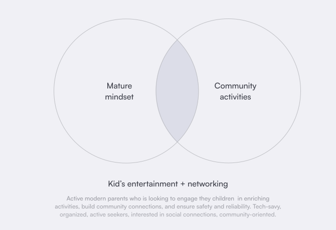
Architecting the Kiddify brand required a delicate strategic balance: creating a visual world that captures the spontaneous energy of childhood while establishing the rigorous trust required by modern parents. I anchored the identity in the Everyman archetype, blending it with hints of the Innocent and Jester to move away from cold, transactional networking toward a sincere, community-first atmosphere.
The resulting mission focuses on effortless social networking, removing the communication friction that often prevents parents from organizing events. Every strategic pillar—from the bold, eye-catching color palette to the empathetic tone of voice—serves a dual purpose: it invites kids into a playful experience while signaling to parents that they are in a safe, verified environment.
.webp)
I translated Kiddify’s strategy into a system that balances childhood energy with the professional credibility required for a parenting ecosystem. The rounded, geometric logo maintains approachability while signaling safety through its synthesis of family, community, and brand symbols.
To drive emotional engagement, I architected a palette of caring pink and vibrant magenta to spark joy, grounded by a trust-focused blue to ensure reliability. This combination of friendly typography and hand-drawn elements creates a high-confidence environment where families feel an immediate sense of belonging.
.svg)
%20(1).webp)
.webp)
.webp)
Find & Join helps parents commit in under 30 seconds through event cards that reveal hosts rating, eliminating decision paralysis while building trust.
Create Event provides a comprehensive yet streamlined path for hosts to define all essential details—child interests, age ranges, location, parent presence requirements—through progressive disclosure and intelligent defaults that reduce cognitive load without sacrificing customization.
Manage Event creates a comprehensive host dashboard that handles the full lifecycle from join request approvals through real-time event modifications to graceful cancellations with automated participant notifications.
.webp)
Quick sketching helped me weed out weak ideas right in the process—rough drawings revealed which navigation patterns felt clunky and which content hierarchies failed before any pixels were invested. Through iterative testing with parents, I identified which event details truly matter.
.webp)
.webp)
I designed the "Find Event" flow to feel like a digital pocket for community life because I know how exhausting it is to hunt for plans in five different group chats. By putting everything on a high-density map, I removed that "digital detective work" and gave parents an immediate sense of what’s happening nearby, which is a huge win for someone like Viktoria who is still finding her feet in a new city.
I architected the activity cards with a strict hierarchy—prioritizing exact timing, location, and available spots—so parents can scan, decide, and commit in under a minute without feeling overwhelmed. The color-coded categories and clear labels for payments aren’t just for looks; they’re there to strip away the social awkwardness and mental load of organizing kids' activities. Even the invitation cards act as a warm digital handshake, making that first step toward a new connection feel completely safe and effortless.
.webp)
.webp)
.svg)
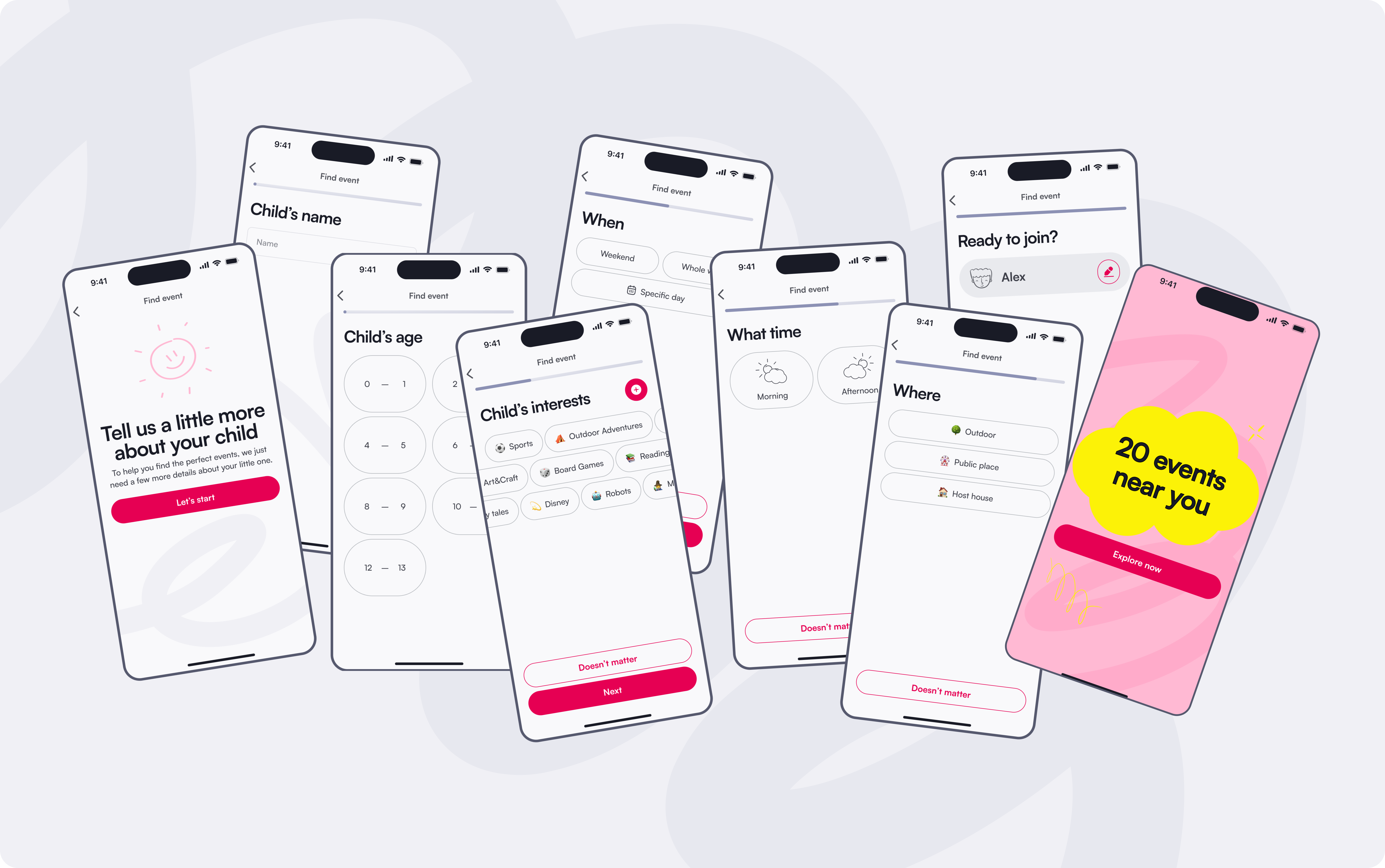
I architected this onboarding flow to act as the «brain» of the entire recommendation engine, ensuring that parents never have to sift through irrelevant noise to find a connection. By designing a series of simple, safe steps focused purely on the child’s age and specific interests, I’m able to personalize the experience before they even see the first event. This progressive disclosure doesn’t just protect privacy—it significantly reduces choice overload by surfacing only the activities that are a perfect match for that specific family.
Each host profile serves as a transparent resume of their community reliability. I prioritized showing first-aid certifications, a history of hosted events, and verified hospitality ratings to ensure that users can move from hesitation to confidence. By making the host's track record fully transparent, I'm turning what used to be a digital gamble into a high-confidence connection.
To complete the trust loop, every participant is cross-referenced against local law enforcement records and public offender registries before joining any event.
.svg)
.webp)
I broke event creation into small, single-focus steps — name, age range, interests, location, timing, group size, and price — so hosts move from idea to published event without ever feeling overwhelmed, whether they start from scratch or let AI scaffold the details. Because each answer quietly narrows who the event is for, the same flow doubles as a matchmaker: it surfaces the event to the families most likely to actually show up, instead of a random crowd.
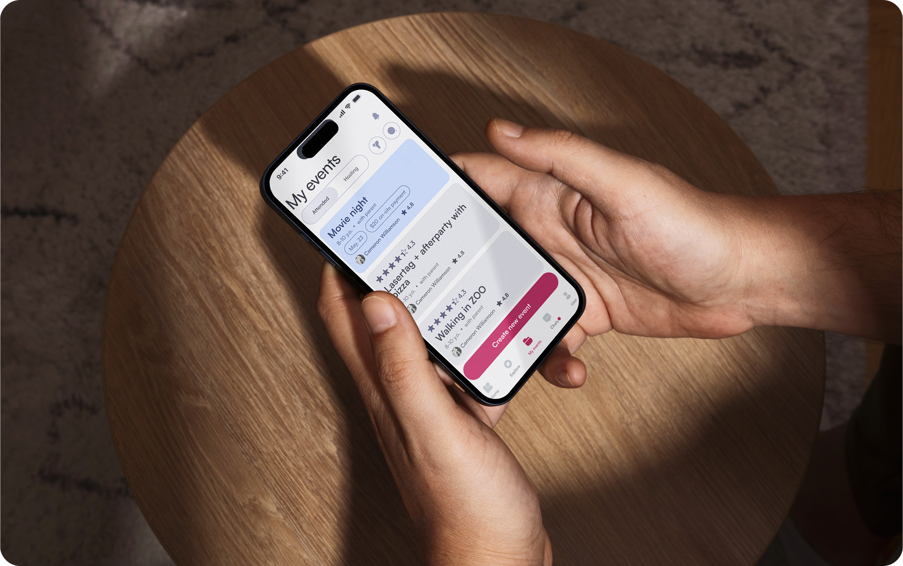
For managing, I kept everything in one place — a dashboard that separates attended and hosted events, surfaces pending join requests at a glance, and keeps participants a tap away. And the event doesn't end when the party does: everyone can download all the photos and videos, rate the host across friendliness, organization, engagement, value, and safety, leave a review, and stay connected with the people they met — turning a single afternoon into lasting community.
Looking back at Kiddify, I took it from a fragmented problem — parents drowning in scattered group chats — to a tested, end-to-end product, entirely on my own: strategy, research, brand, and UX. The project is paused now, because a real launch needs engineering and funding I couldn’t carry alone — but several parents who tested it told me, unprompted, that they’d pay for it. That was enough to confirm the core idea holds. Here’s what the journey taught me.
Every screen traces back to one of the five friction points I mapped in discovery — I designed counterparts, not features. The hardest calls were what to leave out: I deliberately scoped split payments and full messaging for a later release so the MVP could dissolve the three "taxes" that block the very first connection. It taught me that good product thinking is subtraction as much as addition.
Parents' deepest hesitation was never the interface — it was handing their child to an unfamiliar family. Translating that fear into layered, visible verification — ID, police checks, host track records — showed me that safety has to be felt at a glance, not buried in a policy page. Emotional barriers deserve the same design rigor as functional ones.
The brand carried a double job: spark a child's joy and signal a parent's safety in the same frame. Getting a rounded, playful system to also read as credible taught me that visual craft isn't decoration — it's how a product earns trust before a single word is read.
I carried Kiddify as far as one person can — strategy, research, brand, and a validated product. Hitting the wall at engineering and funding wasn't a failure; it where a team becomes the multiplier. That honesty now shapes how I scope what's mine to solve.