A global media-intelligence company sold journalist search and booking to PR and comms teams. Every serious competitor also sold media monitoring. This client didn't, and its buyers expected it.
I came in to design that second product. The audit showed there was nothing solid to launch it into, so the scope grew to the search platform, dashboard, messages, the marketing site and the design system underneath all of them.
Media-monitoring product designed from scratch and live. It is the client's second product line.
Surfaces live on one design system: monitoring, search, dashboard, messages and account, marketing site.
From a screen leaving design to the same screen in the product.
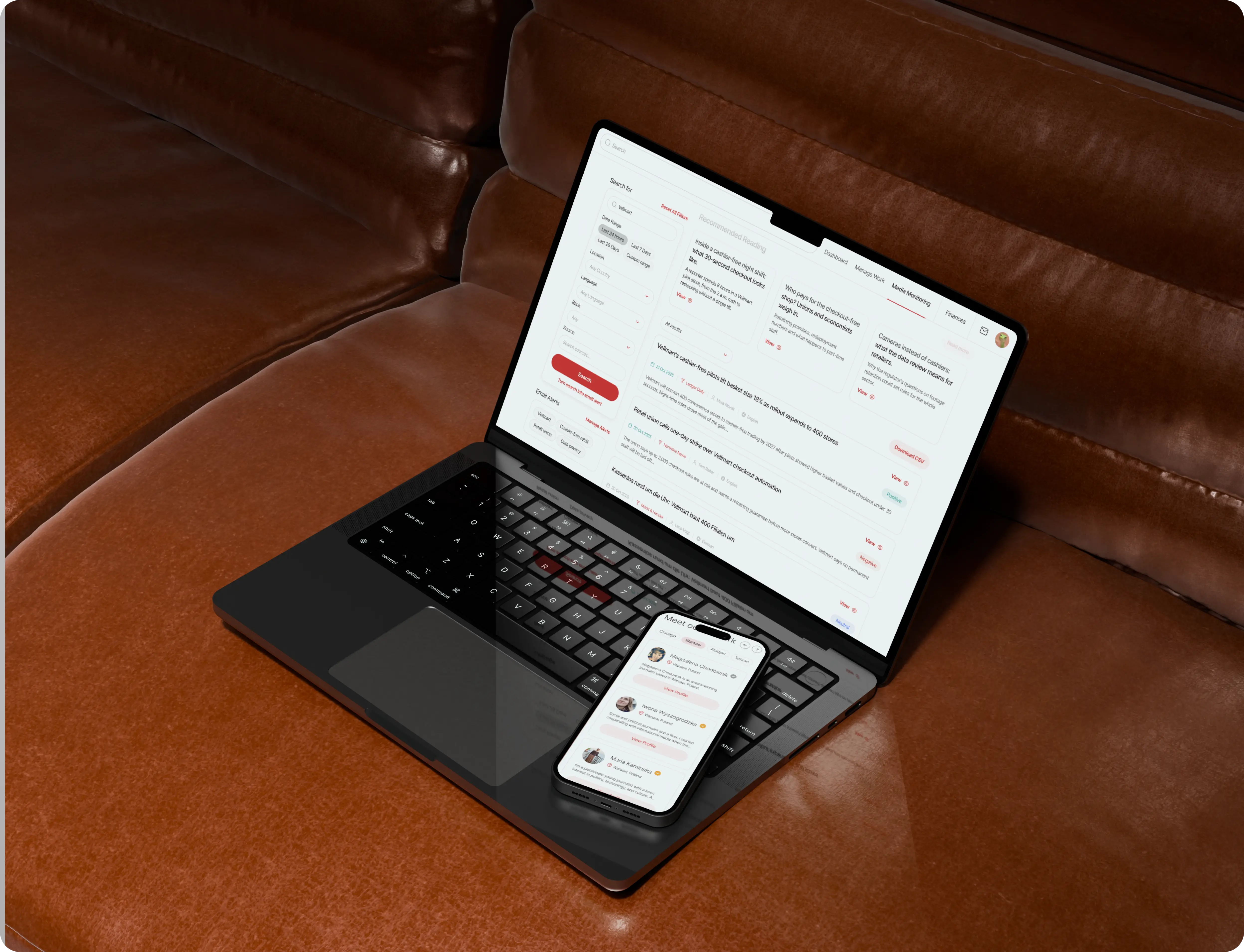
Give the client a second product to sell. A PR team should be able to open it and know within minutes whether today needs their attention, without filtering by hand.
Launch it on a platform that looks like it belongs to a paid product.
Media Monitoring shipped and is live. Around it, the dashboard was redesigned, the search platform updated and the marketing site redesigned to tell the new story, all from one shared design system.
A screen went from design to product in about three days. The collaboration ran nine months and continued past this scope.
Sole product designer, agency side. The client asked for me by name.
New product (0 → 1) + platform redesign
PR managers, comms leads, small-business owners
Jul 2025 – Mar 2026, about 9 months
All competitors are sell media monitoring. Without it, the client had one revenue line and nothing to say in deals where monitoring is assumed.
The flagship platform had shipped at speed. Patterns drifted, type was uneven, and empty and error states were missing. The marketing site still described a one-product company.
On the user side, a PR manager tracking 5–10 brands cleared 200+ irrelevant alerts a day and lost 2–3 hours to filtering before acting on anything. In a survey of about 300 PR professionals, irrelevant and missing coverage was the biggest complaint about monitoring tools.
There was no research budget and no access to end users. What I knew about PR teams came from the client team's complaints, public industry research, and six competitor products I took apart screen by screen.
Design ran about three days ahead of build, so there was no time for a second draft. Each first decision had to be close to final and reusable across the system.
With no budget and no users to interview, I built the picture from what was there: the live product, the client team's complaints, public industry research and six competitors. Five outputs came out of that week, each built on the one before. The rest of the project ran on them.
I also took the existing platform apart the way a customer would and logged what broke: pattern drift, uneven type, empty and error states nobody had drawn. That list became the redesign backlog.
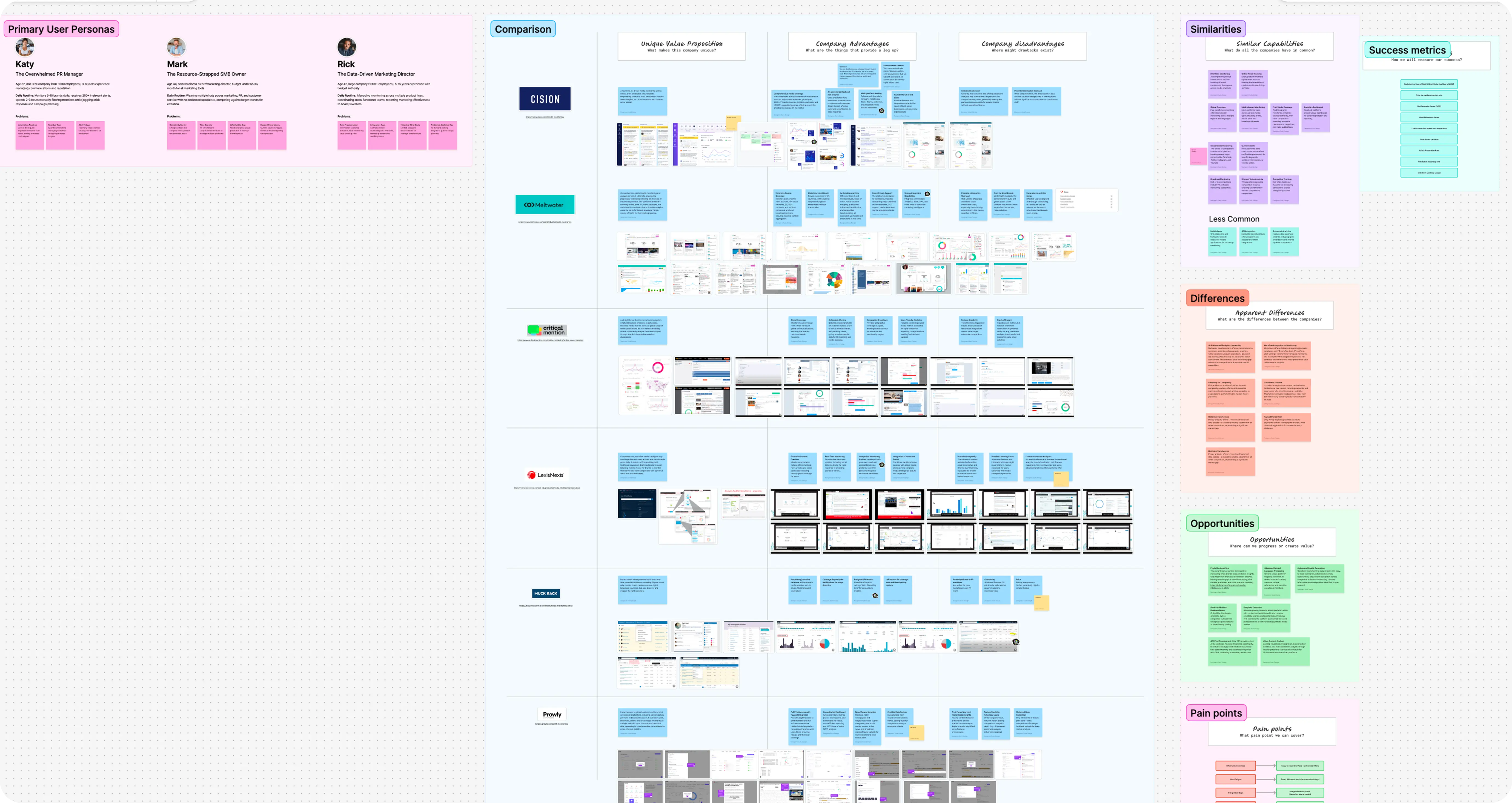
Katy, the overwhelmed PR manager. Mark, the small-business owner who wears every hat. Rick, the marketing director who reports to the board. Each one owns a different failure: overload, cost, fragmented data.
Six competitors compared. All of them ship real-time monitoring, online news and analytics dashboards. They split on AI analytics, workflow integration, and curation versus volume.
What almost nobody does well: predictive analytics, advanced language processing, pricing a small team can afford, and an API-first approach. The first two shaped the AI summary. Pricing was already suited small businesses. The API idea held up, but the client kept it out of this phase, so it went to the team's backlog.
Information overload, alert fatigue, no forward view, high cost, integration gaps. The first three became design work. Cost was covered by the client's pricing, and integrations went to the backlog with the API.
Defined before I had access to any data: engagement (DAU/MAU), trial-to-paid, NPS, triage time and device split.
A PR manager tracking 5–10 brands lost 2–3 hours a day filtering coverage by hand before acting on anything. Every competitor reports the past, and a forward read was the widest gap in the research.
People quote this product to their board, so a summary nobody can check is a liability. The AI branch was also marked "to clarify" on the flow map: I designed the interface before engineering confirmed what the model could support.
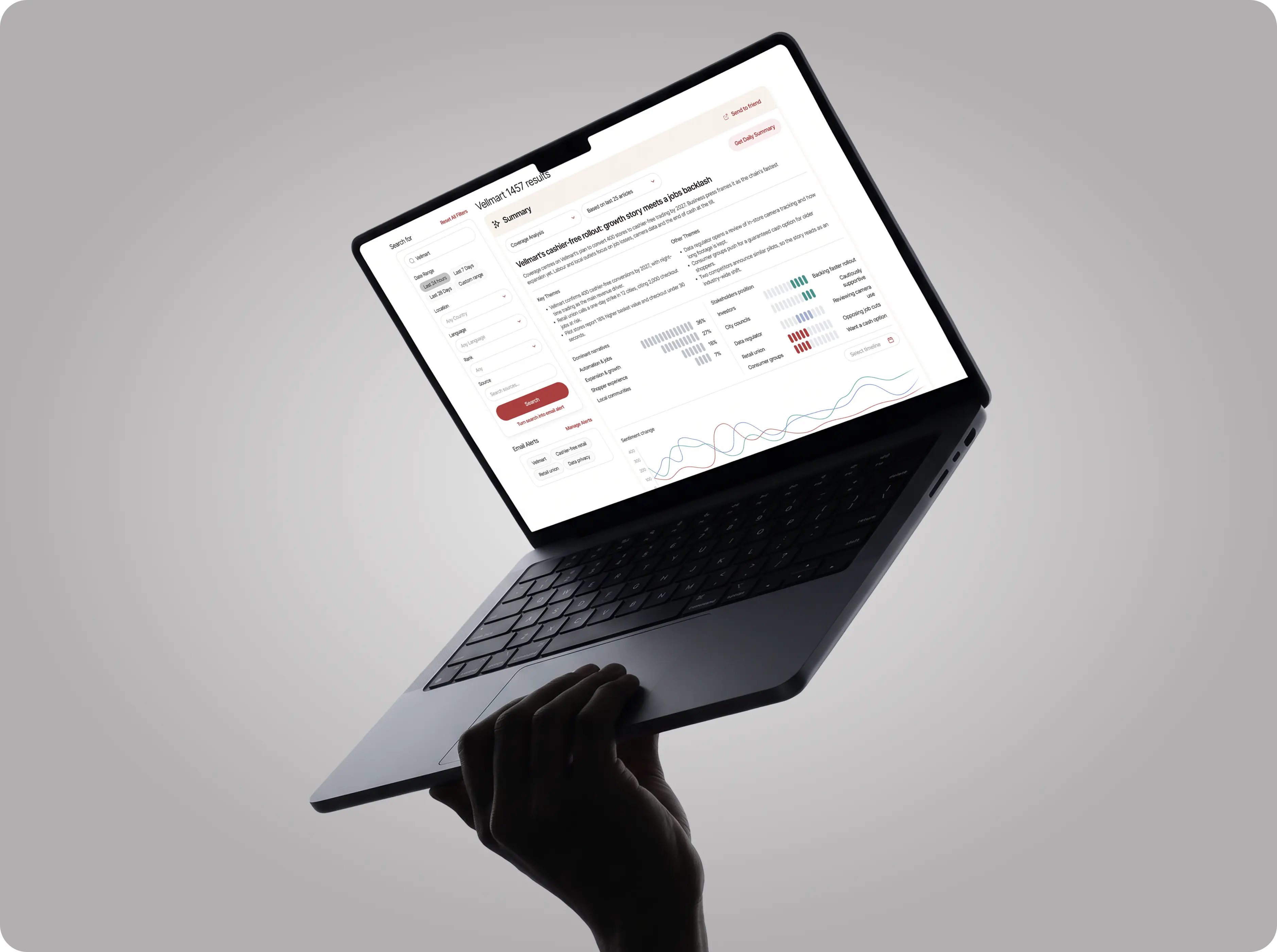
One results page: filters on the left, a summary on top, recommended reading and the full sentiment-tagged list below. Any search can become an email alert, and any summary a daily one.
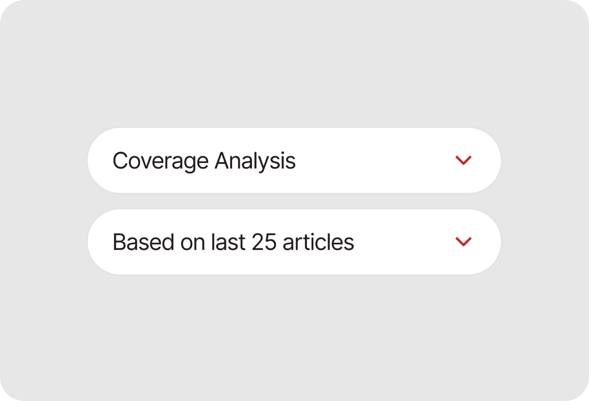
"Based on last 25 articles" sits next to the analysis type. The reader knows what the summary covers and can change it.
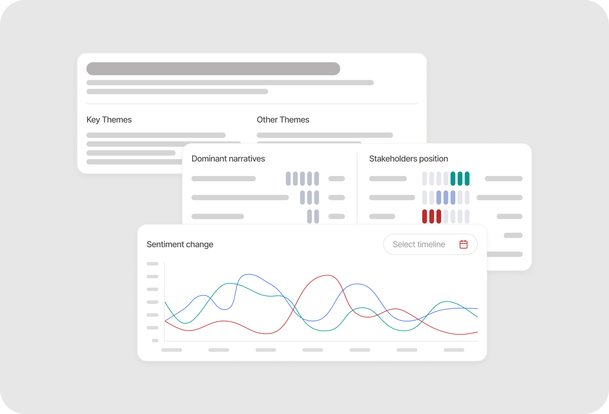
Headline, key and other themes, dominant narratives ranked by share, stakeholder positions, and sentiment across the year.
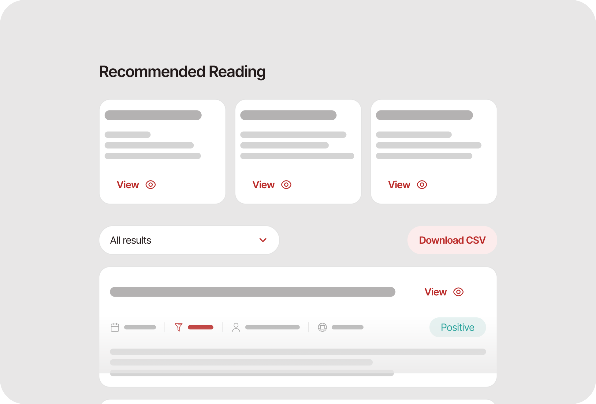
Recommended reading and the full results sit directly under the summary, with CSV export.
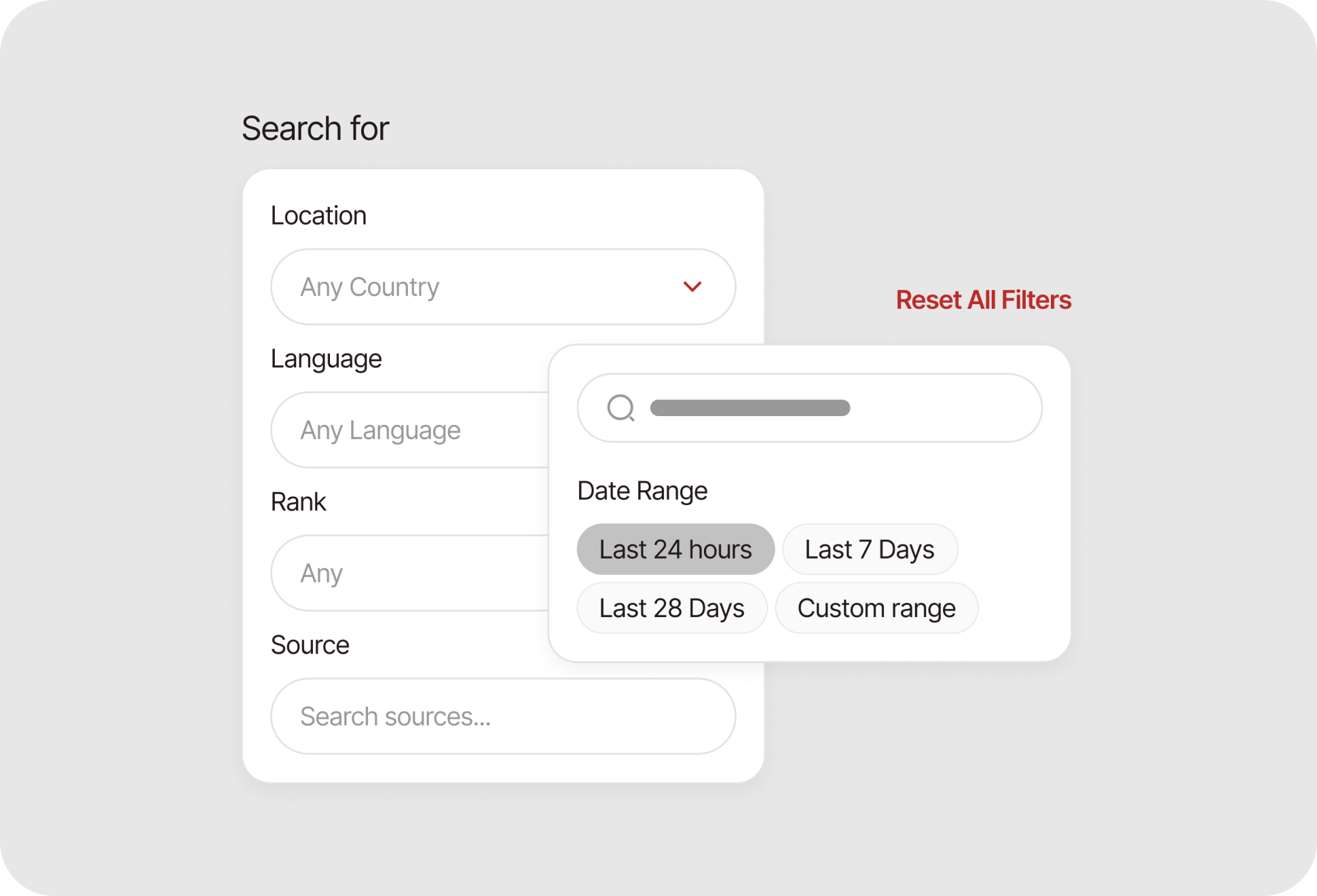
Date range, location, language, rank and source narrow the set before anyone reads it. One link resets them all.
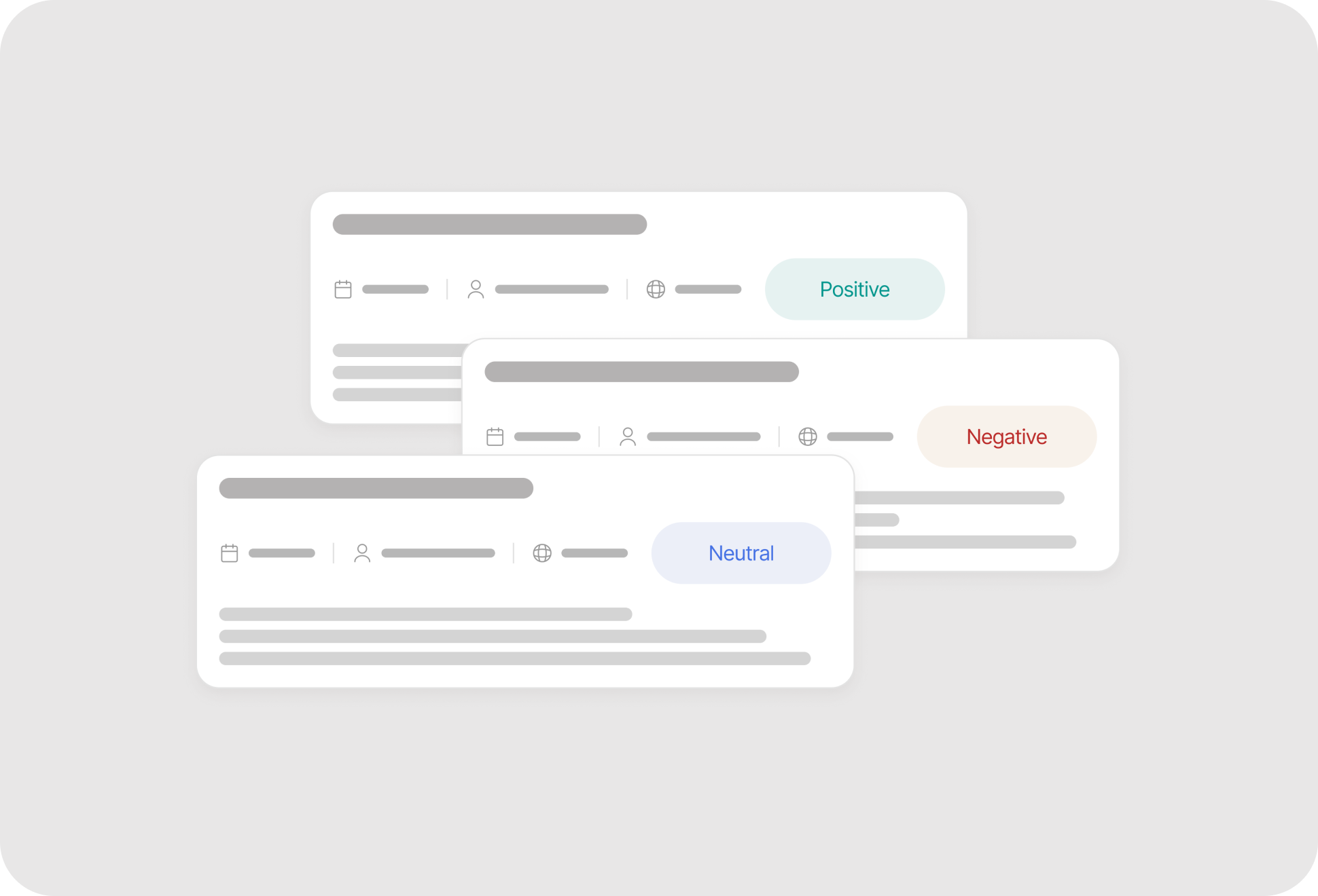
Each card shows date, source, journalist, language and a positive, negative or neutral tag, so the list can be scanned for what needs a response.
"Turn search into email alert" sits under the Search button, and saved alerts stay in the sidebar.
Content-authenticity checks, a credibility score for each source and tracking of disinformation as it spreads. Brand protection for a time when synthetic media is cheap to produce.
Reading past positive, negative and neutral: sarcasm, cultural references, and how a narrative changes as coverage comes in. A three-way tag can't tell praise from sarcasm.
Logo recognition in video, visual brand mentions and sentiment read from facial expressions. Aimed at TikTok and short-form video, where a brand can appear on screen without being named in the text.
The same account can hire journalists or work as one. In the old design, switching between the two meant opening account settings and changing it there.
One designer, working on the new product at the same time, three days ahead of the build. The dashboard had to be assembled from parts the design system already had.
A mode switch next to the greeting, a next-actions band that covers both products, and job status, news and inbox below. Live.
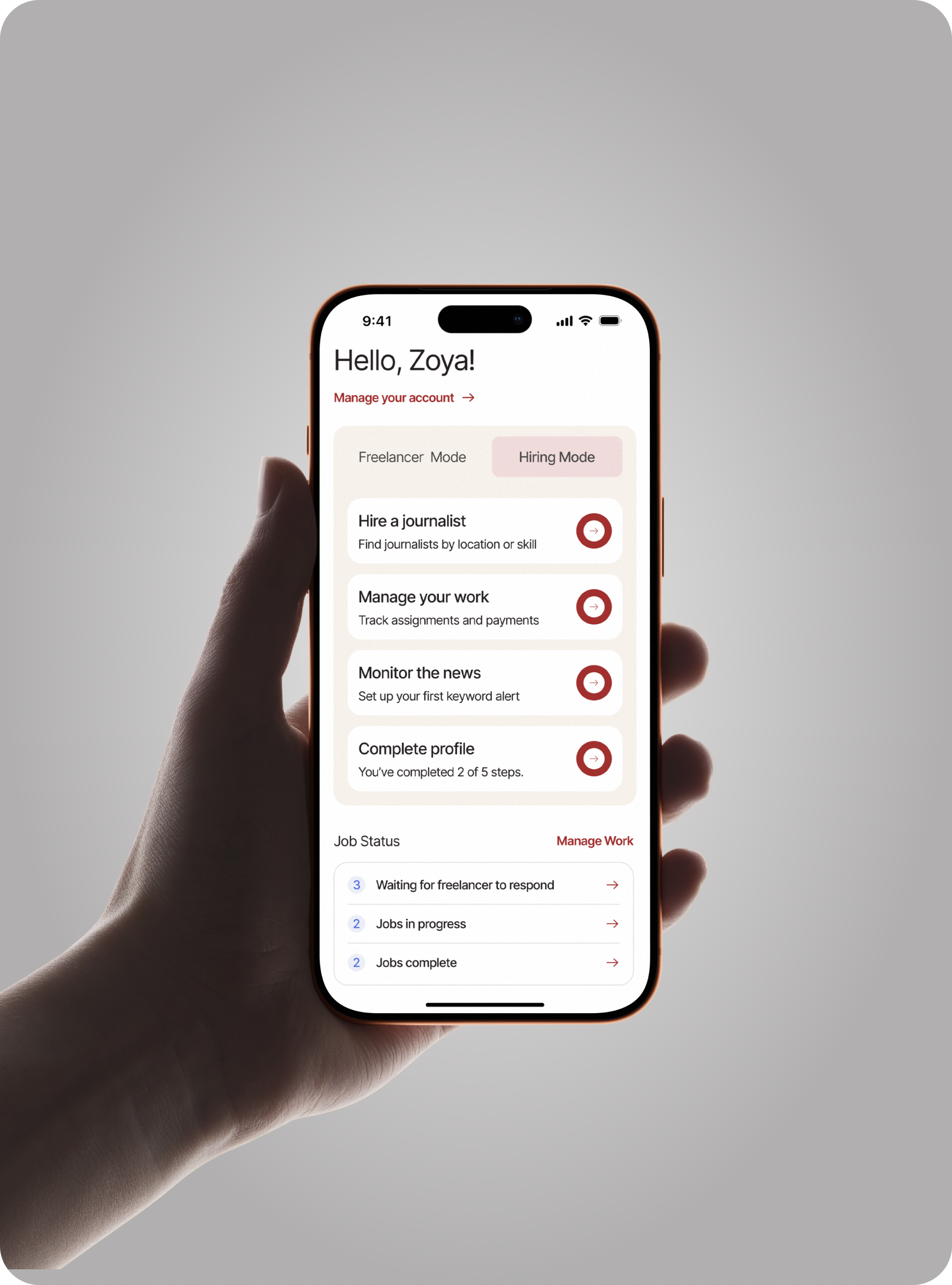
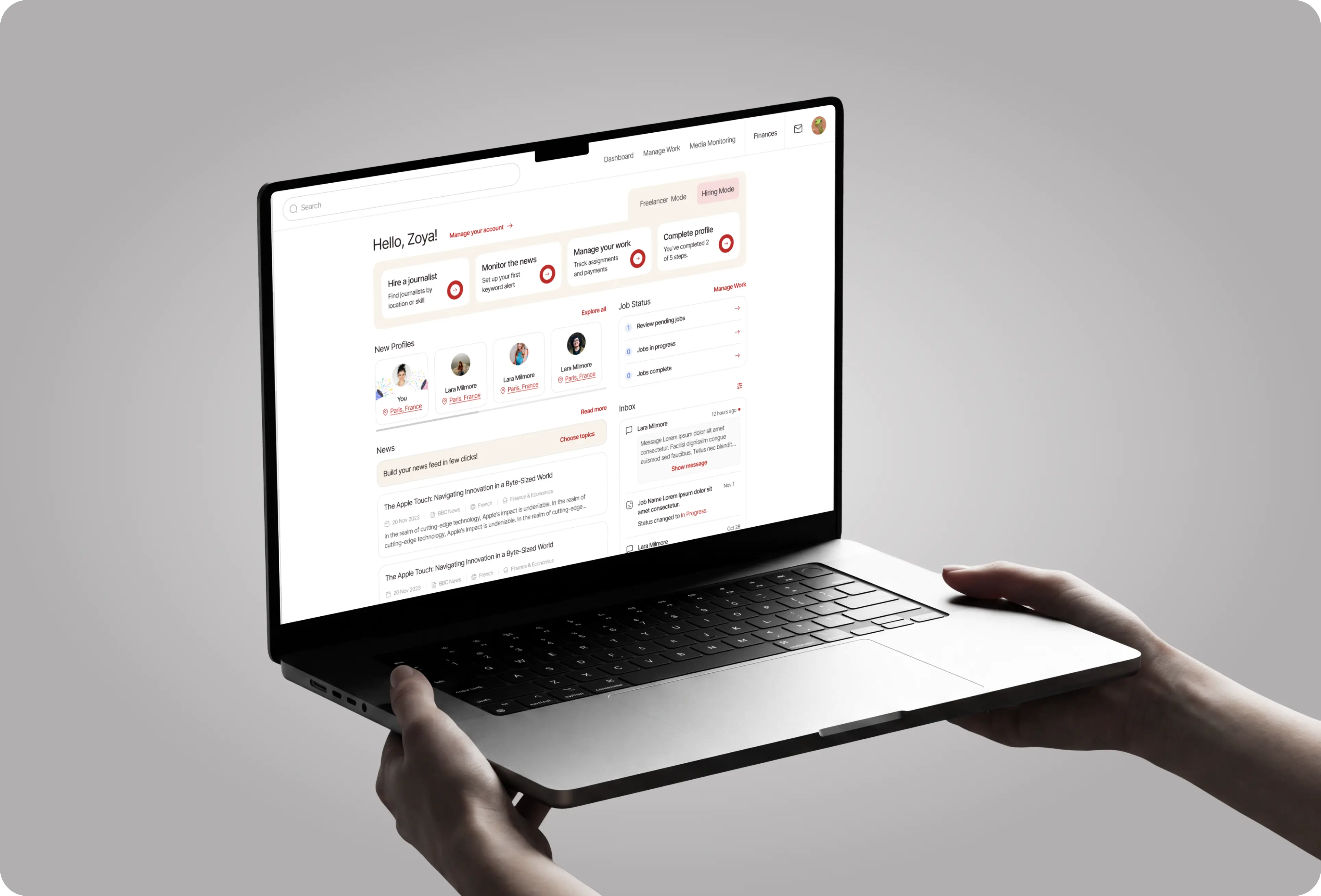
The Freelancer / Hiring toggle sits next to the greeting. Before, switching meant a trip into account settings.
Hire a journalist, monitor the news, manage your work, complete your profile (2 of 5 steps). "Set up your first keyword alert" puts Media Monitoring next to booking.
Job status (pending, in progress, complete), new profiles, a news feed with a "Choose topics" prompt, and an inbox that mixes messages with job status changes.
Buyers search for journalists, open a profile, book and talk. The platform was live and had shipped at speed: patterns drifted, type was uneven, and some screens had never been designed at all, from popups to the 404 page to empty and error states.
An existing product with its own team and releases, while Media Monitoring took most of my time. Every change had to fit the screens already in place and land without stopping a release.
Search results, profiles, settings, messages - mostly all screens updated to the shared design system, and the missing screens designed from its parts. The updated screens are live.
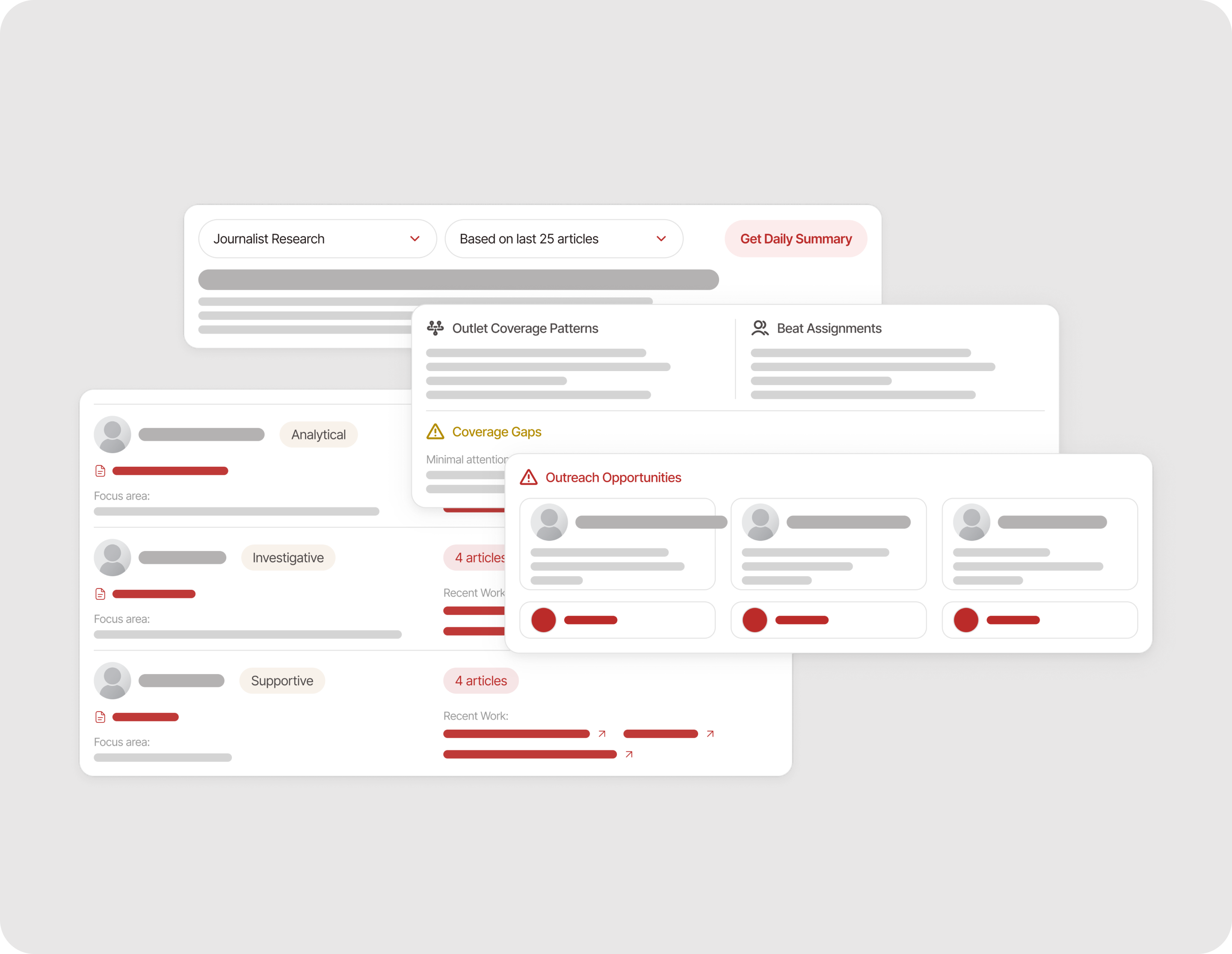
A summary type that answers who to pitch: each journalist's outlet, focus area and recent work, then coverage gaps and outreach opportunities.
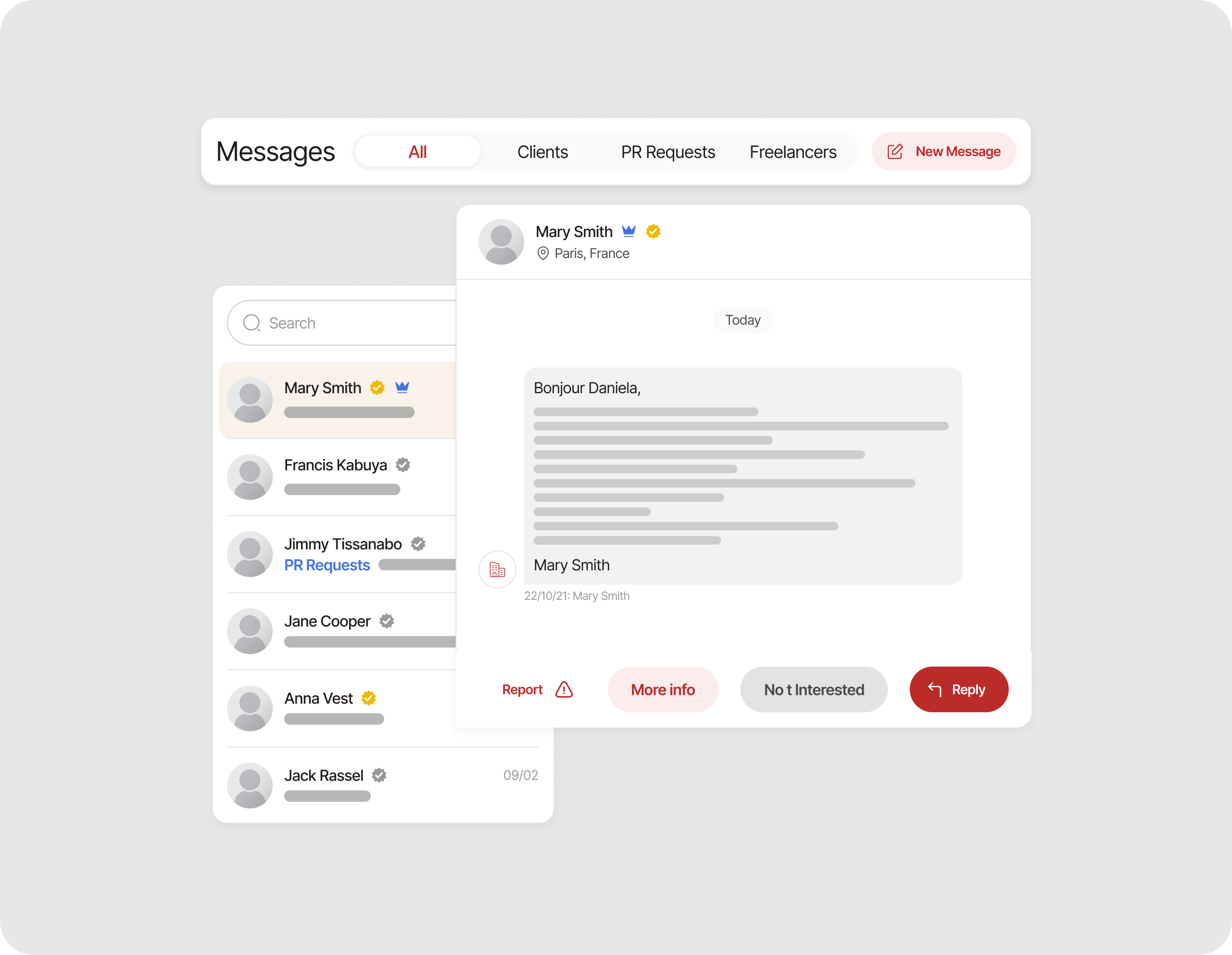
Conversations split into All, Clients, PR Requests and Freelancers. Report, More info, Not Interested and Reply sit under the open message.
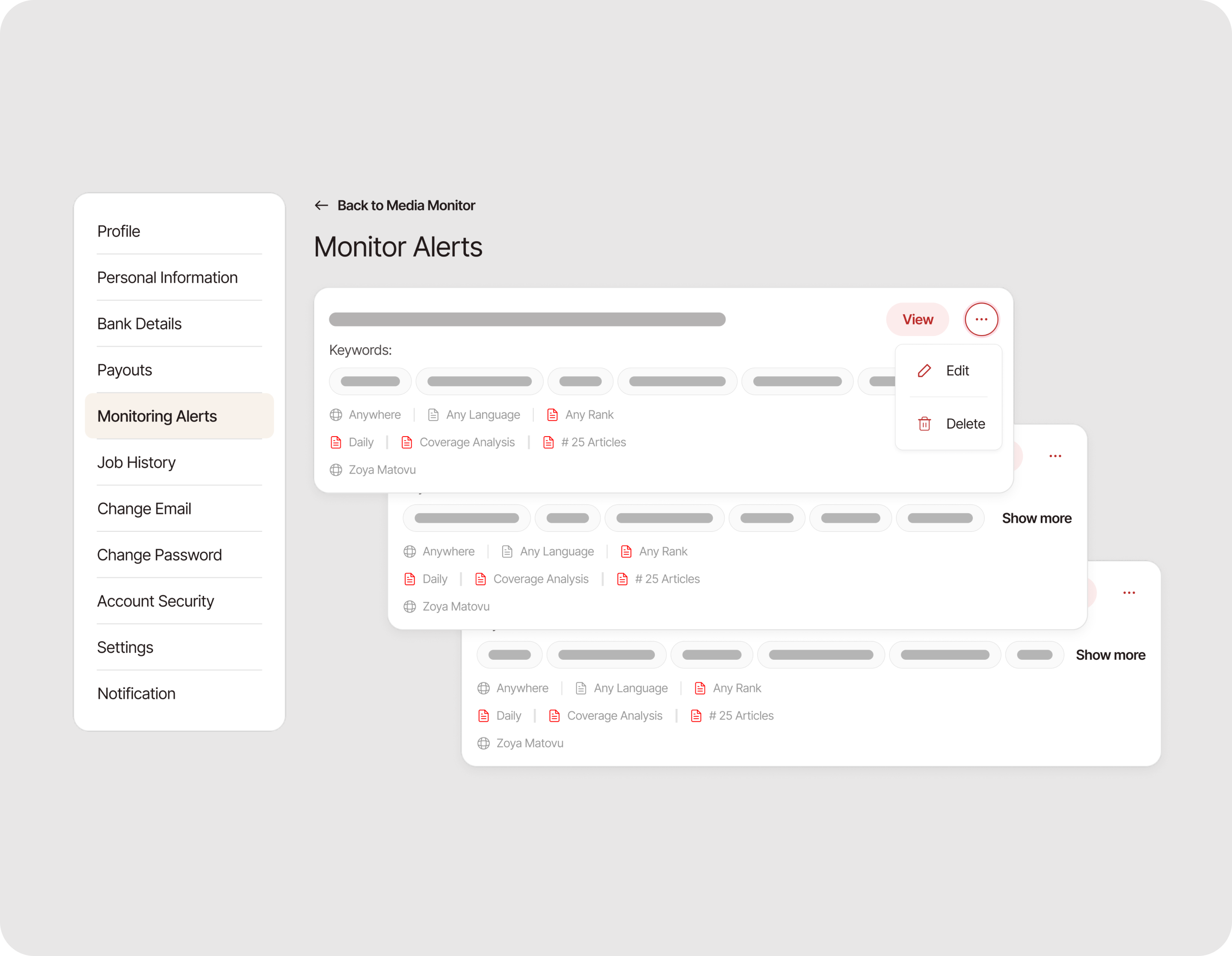
Every saved search in one list. Each card shows its keywords, location, language, rank, frequency and analysis type, so an alert can be read without opening it.
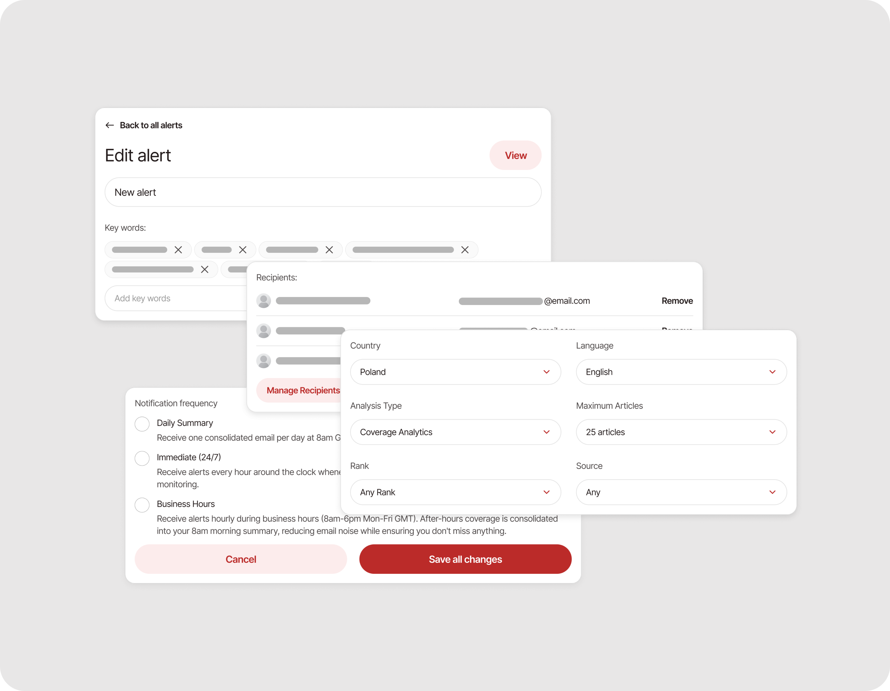
Edit and Delete sit behind the "…" menu on each card, which keeps the list readable and Delete one step away from a stray click.
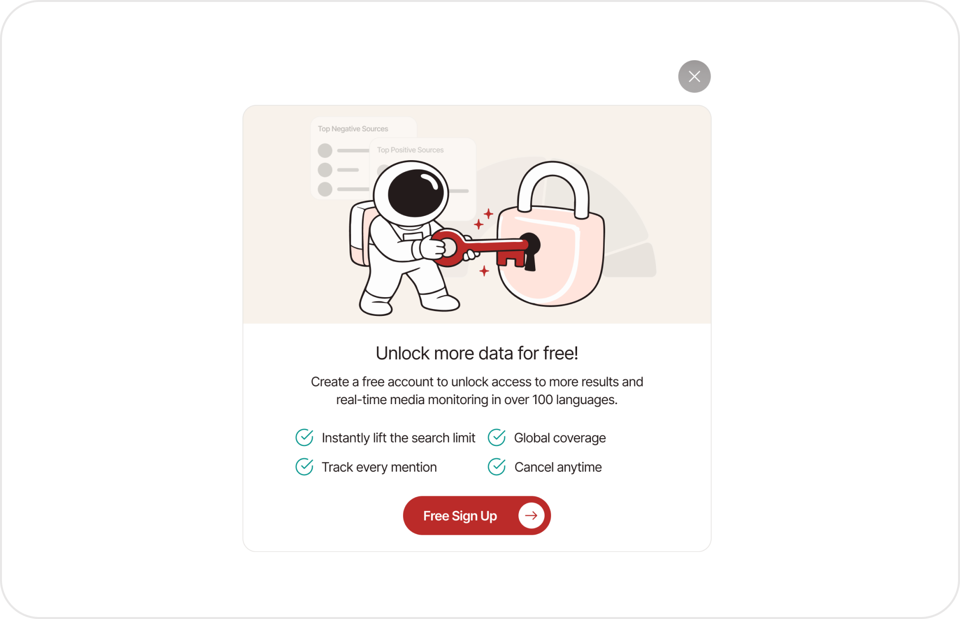
Missing popups
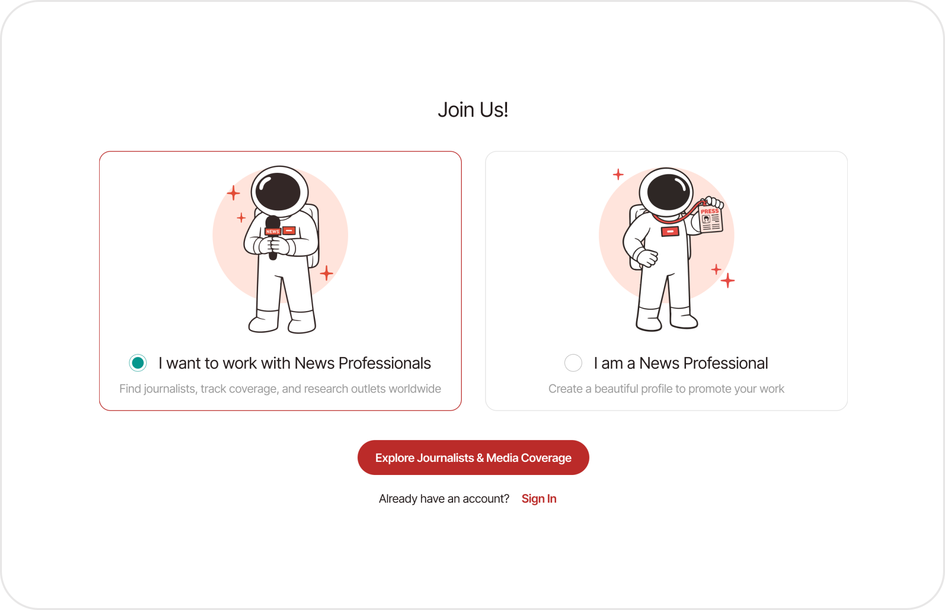
Brining more fun
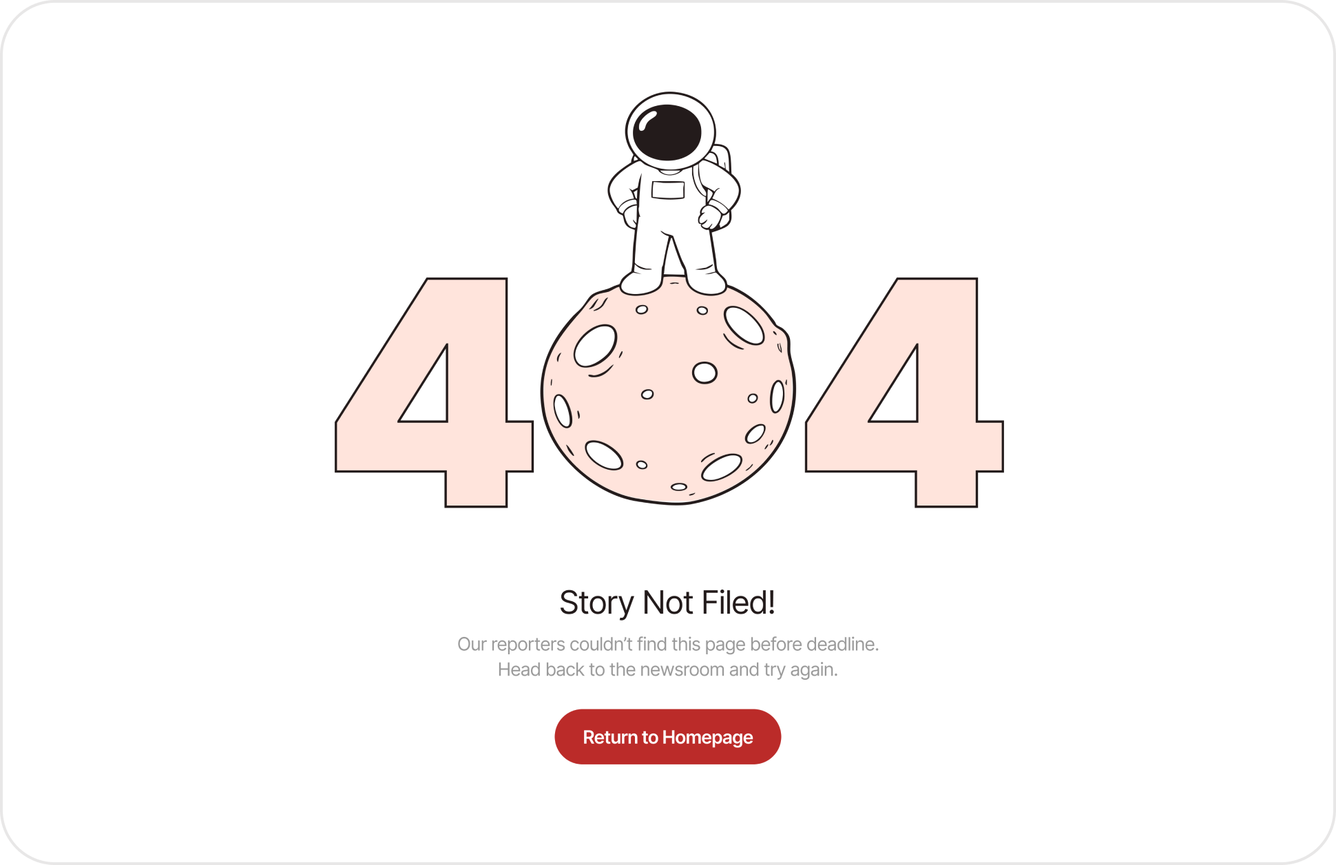
Forgotten screens
The site still described a one-product company: no monitoring story, weak credibility cues and no room to explain what the company now did. I redesigned it, design only, around both products.
The home page now tells the monitoring story and adds the credibility cues a paid tool needs. The Media Monitoring page says what it is and who it is for
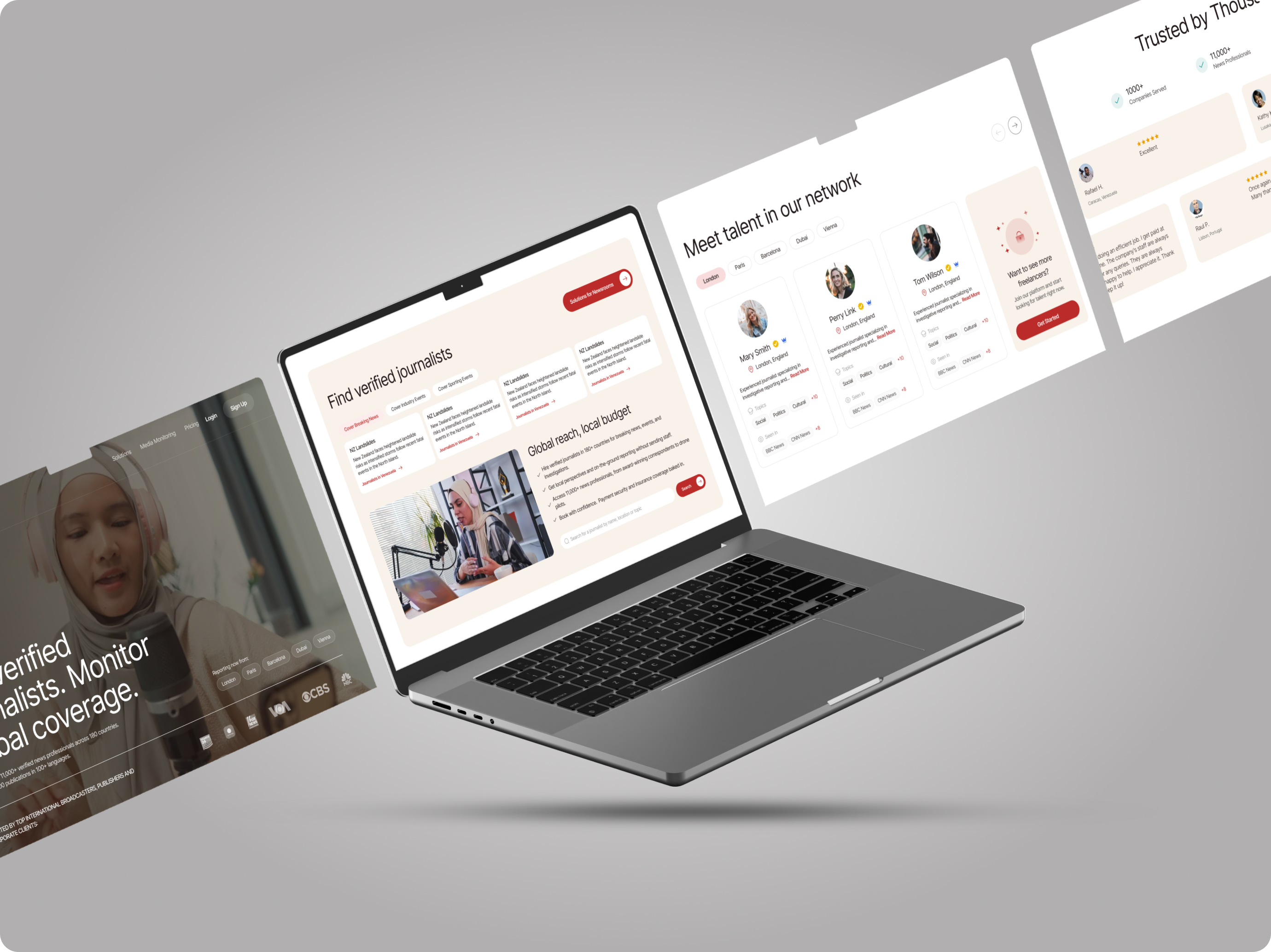
As the only designer, about three days ahead of the build, I shipped a new product and brought the platform around it into one system
Media-monitoring product designed from scratch and live. It is the client's second product line.
Surfaces live on one design system: monitoring, search, dashboard, messages and account, marketing site.
From a screen leaving design to the same screen in the product.
The filters, the result card and the summary all came from the same move: rank every data point by how often it drives a decision, then cut or demote the rest. Styling was the easy part.
The AI summary added one more rule. Generated text is useful only when the reader can see what it read.
